

Neutral inredning: komplett guide för ett harmoniskt hem
Kort sagt:
- Neutral inredning handlar om att använda jordnära färger och naturliga material för ett harmoniskt hem. Balans, textur och hållbarhet är nycklar för att skapa ett levande, tidlöst intryck. Rätt färg, material och belysning kombineras för att bygga ett lugnt och inbjudande hem som kan uppdateras över tid.
Neutral inredning är konsten att kombinera mjuka, jordnära färger och naturliga material för att skapa ett lugnt och inbjudande hem. Stilen bygger på balans snarare än kontrast, och den tidlösa estetiken gör den till ett av de mest populära valen i svenska hem 2026. De vanligaste basfärgerna är beige, greige, sand, off-white och varmgrått. Dessa toner skapar värme med en minimalistisk känsla. 60-30-10-regeln är den mest använda metoden för att fördela färger i en neutral palett: 60 % basfärg, 30 % sekundärfärg och 10 % accentfärg.
1. Neutral inredning: de bästa färgerna och hur du kombinerar dem
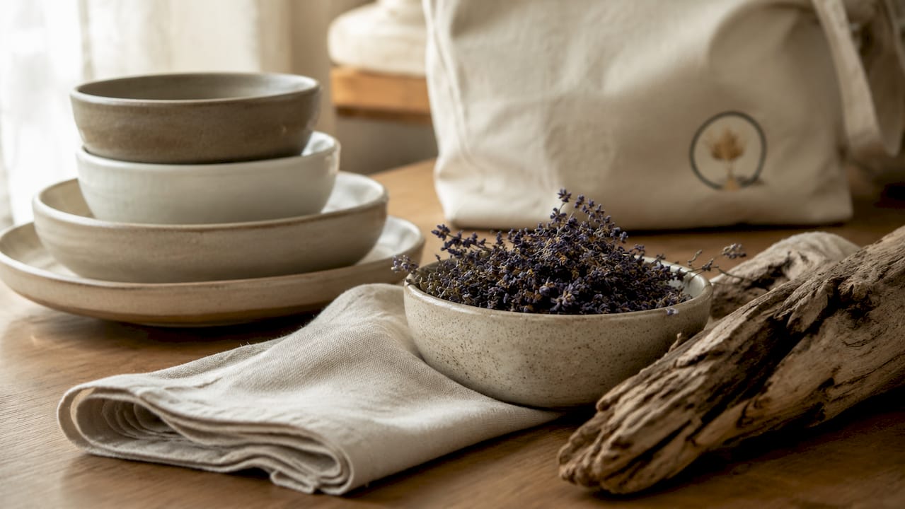
Populära neutrala toner 2026 är beige, greige, sand, off-white och varmgrått. Dessa färger föredras framför kylig kritvit eftersom de ger ett varmare och mer inbjudande intryck. Valet av rätt nyans avgör om ett rum känns tryggt och sammanhållet eller splittrat och kallt.
De fem basfärgerna
- Beige är den klassiska neutralen. Den fungerar på väggar, golv och stora möbler utan att dominera rummet.
- Greige är en blandning av grått och beige. Den passar i rum där du vill ha lite mer sofistikation utan att tappa värmen.
- Sand ger ett jordnära och naturligt intryck. Den fungerar särskilt bra i sovrum och vardagsrum med trädetaljer.
- Off-white är mjukare än ren vit och undviker det sterila intrycket. Den lyfter ljuset i mörka rum.
- Varmgrått är ett modernt alternativ till kallt grått. Det kombinerar bra med både trä och textilier i linne och ull.
Undvik den vanligaste fallgropen
En konsekvent färgstrategi är avgörande för att undvika en orolig känsla i hemmet. Att blanda varma och kalla neutrala undertoner i samma rum skapar en splittrad känsla. Bestäm tidigt om din palett ska luta åt det varma eller kalla hållet, och håll dig till det valet genom hela rummet.
Accentfärger som fungerar
Accentfärger i en neutral palett bör vara dova och jordnära. Terrakotta, skogsgrön, mörkblå och roströd fungerar alla som 10-procentsfärger utan att bryta den lugna helheten. Placera accentfärgen i kuddar, ett konstverk eller en vas för att ge rummet karaktär utan att störa balansen.
Proffstips: Testa alltid en färgprov på väggen i olika ljusförhållanden innan du bestämmer dig. Neutrala färger skiftar kraftigt beroende på om det är morgonljus eller kvällsbelysning.
2. Material och texturer som ger liv åt neutrala rum
Lager av olika material och texturer är nyckeln till en neutral inredning som känns levande och inbjudande. Utan texturvariationer riskerar ett neutralt rum att se platt och ointressant ut. Det är skillnaden mellan ett rum som ser ut som ett hotellrum och ett hem som känns personligt.
Naturliga material att prioritera
- Trä ger värme och organisk känsla. Välj ljusa träslag som ek eller ask för en nordisk ton, eller mörkare valnöt för mer tyngd.
- Ull i form av mattor, filtar och kuddar tillför mjukhet och taktilitet. En ullmatta på ett trägolv förändrar hela rummets känsla.
- Linne är det naturliga valet för gardiner och sängkläder. Det hänger vackert och åldras med grace.
- Sten och keramik ger kontrast mot mjuka textilier. En stenbänkskiva i köket eller en keramikvas på hyllan bryter av på ett bra sätt.
- Rotting och korg tillför organisk struktur. En korgkorg eller en rotingstol ger rummet ett hantverk som plastmaterial aldrig kan ersätta.
Kontraster skapar djup
Kombinationen av grova och släta ytor är det som ger ett neutralt rum visuell spänning. En slät linnesoffa bredvid en grov ullmatta, eller en polerad keramikvas på en rå träskiva, skapar den kontrast som håller ögat intresserat. Utan dessa kontraster blir rummet monotont trots att färgerna är vackra.
Proffstips: Lägg till minst tre olika texturer i varje rum: en mjuk, en hård och en organisk. Det är en enkel regel som gör stor skillnad.
3. Möblering och dekorationsprinciper för ett neutralt hem
Balans i ett neutralt hem uppnås genom medvetna val av placering, mängd och belysning. Det handlar inte om att ha lite, utan om att ha rätt.
Tillämpa 60-30-10-regeln i praktiken
60-30-10-regeln gäller inte bara färg utan också möblering och dekorationsdetaljer. Fördela på följande sätt:
- 60 % basfärg täcker väggar, golv och de största möblerna som soffa och sänggavel.
- 30 % sekundärfärg finns i textilier, mindre möbler och hyllor.
- 10 % accentfärg placeras i kuddar, konst och dekorativa föremål.
Denna fördelning skapar en naturlig hierarki i rummet och gör det enkelt att byta ut detaljer utan att hela inredningen behöver göras om.
Begränsa antalet objekt på ytor
Högst 3–5 objekt per yta och pynt grupperat i tripletter ger visuell ro. Tre föremål i olika höjder, till exempel en vas, ett ljus och en liten skulptur, ser mer genomtänkt ut än fem föremål i samma storlek. Tomma ytor är inte ett misslyckande. De är en del av designen.
Belysning i tre lager
Belysning planeras bäst i tre lager: ambient ljus, arbetsljus och accentljus. Ambient ljus ger grundbelysningen i rummet. Arbetsljus lyser upp specifika ytor som skrivbord eller kök. Accentljus framhäver konstverk, hyllor eller arkitektoniska detaljer. Dimmerfunktion på minst ett av lagren gör det möjligt att förändra rummets känsla från dag till kväll utan att byta en enda möbel.
One-in-one-out-regeln
One-in-one-out-metoden förebygger att ett neutralt hem sakta fylls med onödiga föremål. Varje gång något nytt köps in, lämnas något gammalt bort. Kombinera detta med en regelbunden genomgång av alla ytor, öppna hyllor och förvaringslösningar. Det håller ordningen utan att det känns som ett ständigt projekt.
Proffstips: Fotografera rummet med din telefon och titta på bilden. Kameran ser röran som ögat vänjer sig vid. Det är ett enkelt sätt att identifiera vad som kan tas bort.
4. Hur du skapar ett färgschema för inredning steg för steg
Ett genomtänkt färgschema är grunden för all neutral inredning. Utan ett tydligt schema riskerar du att köpa möbler och textilier som inte hänger ihop.
Börja med att välja en ankarfärg. Det är den färg som dominerar rummet och täcker 60 % av ytan. Välj en ton du trivs med i alla ljusförhållanden. Testa den på väggen i minst en vecka innan du bestämmer dig.
Välj sedan en sekundärfärg som är besläktad med ankarfärgen men har en annan ton eller intensitet. Om ankarfärgen är varmgrå kan sekundärfärgen vara linnevit eller ljus sand. Dessa två färger ska fungera ihop utan att smälta samman helt.
Avsluta med en accentfärg som ger kontrast. Den ska vara tydligt annorlunda men ändå harmoniera med de övriga tonerna. En terrakottafärgad kudde mot en varmgrå soffa är ett klassiskt exempel. Håll accentfärgen till 10 % av rummet för att den ska ha effekt utan att ta över.
Läs mer om jordnära färgkombinationer för konkreta exempel på hur dessa paletter fungerar i svenska hem.
5. Gråa nyanser i inredning: så använder du dem rätt
Grått är den neutrala färg som missbrukas mest. Fel grå nyans i fel rum kan göra ett hem kallt och trist. Rätt grå nyans gör ett rum tidlöst och elegant.
Varmgrått innehåller undertoner av beige, brun eller gul. Det fungerar i rum med naturligt ljus och passar bra med trä och linne. Kall grå innehåller undertoner av blå eller grön. Den passar i moderna rum med mycket stål och glas, men kan kännas klinisk i ett vardagsrum.
Testa alltid grå nyanser mot dina befintliga möbler och golv. En grå nyans som ser perfekt ut i butiken kan se helt annorlunda ut hemma. Köp alltid ett provpapper och låt det sitta på väggen i minst 48 timmar.
Gråa nyanser fungerar bäst som basfärg eller sekundärfärg, aldrig som accentfärg i en neutral palett. Som accentfärg försvinner grått och bidrar inte med den kontrast som behövs.
6. Minimalistisk stil kontra neutral inredning: vad är skillnaden?
Minimalistisk stil och neutral inredning är besläktade men inte identiska. Minimalismen handlar om att minska antalet föremål till ett minimum. Neutral inredning handlar om att välja lugna färger och harmoniska material, oavsett hur många föremål som finns i rummet.
Ett neutralt rum kan vara fullt av textilier, växter och konst och ändå kännas lugnt. Ett minimalistiskt rum kan ha starka färger och ändå vara sparsamt möblerat. De flesta svenska hem kombinerar de två stilarna: neutral färgpalett med ett medvetet begränsat antal föremål.
Den nordiska traditionen av enkelhet och funktion passar naturligt ihop med neutral inredning. Läs mer om skandinavisk inredning för att se hur dessa principer tillämpas i moderna svenska hem.
7. Hållbarhet och långsiktiga val i neutral inredning
Investera i stora möbler och fasta element för hållbarhet, och byt ut textilier och smådetaljer för att fräscha upp inredningen regelbundet. Det är ett ekonomiskt och miljömässigt klokt sätt att hålla hemmet aktuellt utan att köpa nytt hela tiden.
Principer för hållbar neutral inredning
- Köp soffa, matbord och sänggavel i hög kvalitet. Dessa möbler ska hålla i minst 10–15 år.
- Byt kuddar, gardiner och sängkläder när du vill ha en ny känsla. Det kostar lite men gör stor skillnad.
- Välj begagnade möbler i neutrala träslag och tidlösa former. Begagnat trä har en patina som nyproducerat aldrig kan efterlikna.
- Undvik trendiga möbler i starka färger. De åldras snabbt och tvingar fram ett nytt köp inom några år.
- Välj naturmaterial framför syntetiska. Ull, linne och trä åldras vackert. Polyester och plast gör det inte.
Torkade växter och pampasgräs är ett utmärkt exempel på hållbar dekoration. De kräver ingen skötsel, håller i flera år och passar perfekt i en neutral färgpalett. Torrdecor specialiserar sig på just denna typ av hållbara inredningsdetaljer för moderna hem.
Viktiga insikter
Neutral inredning lyckas när färgval, material och belysning samverkar i en genomtänkt helhet som håller över tid.
| Punkt | Detaljer |
|---|---|
| Välj en konsekvent palett | Bestäm tidigt om paletten ska vara varm eller kall och håll dig till det valet. |
| Tillämpa 60-30-10-regeln | Fördela basfärg, sekundärfärg och accentfärg i rätt proportioner för balans. |
| Blanda texturer medvetet | Kombinera minst tre texturer per rum för att undvika ett platt och sterilt intryck. |
| Planera belysning i tre lager | Ambient, arbets- och accentljus med dimmerfunktion ger flexibel atmosfär. |
| Investera rätt | Köp kvalitetsmöbler för lång livslängd och byt textilier för förnyelse. |
Neutral inredning behöver inte vara tråkig
Många tror att neutral inredning betyder tomt och sterilt. Det stämmer inte. Kuratering av få men betydelsefulla föremål ger karaktär och personlighet. Det handlar om att välja rätt, inte om att välja lite.
Det jag ser oftast när neutral inredning misslyckas är inte att det finns för mycket. Det är att det saknas textur och värme. Rummet är neutralt i färg men också neutralt i känsla. Det är inte målet. Målet är ett rum som känns lugnt men levande.
Mitt råd är att börja med ett rum och göra det färdigt innan du går vidare. Välj din ankarfärg, lägg till tre texturer, planera belysningen och placera 3–5 föremål på varje yta. Fotografera resultatet. Lev med det i en vecka. Justera sedan det som inte känns rätt.
Det vanligaste misstaget är att blanda varma och kalla neutraler utan att märka det. En beige soffa, ett kallt grått golv och en off-white vägg med blå undertoner skapar en orolig känsla som är svår att sätta fingret på. Lösningen är enkel: titta på undertonen i varje yta och se till att de pekar åt samma håll.
Neutral inredning är inte en stil du skapar en gång och sedan är klar med. Det är ett levande hem som uppdateras med nya textilier, nya växter och nya detaljer. Håll grunderna stabila och låt detaljerna förändras med årstiderna.
— a4
Dekorera neutralt med Torrdecor
Torrdecor erbjuder ett sortiment av torkade växter och vaser som passar direkt in i en neutral färgpalett.
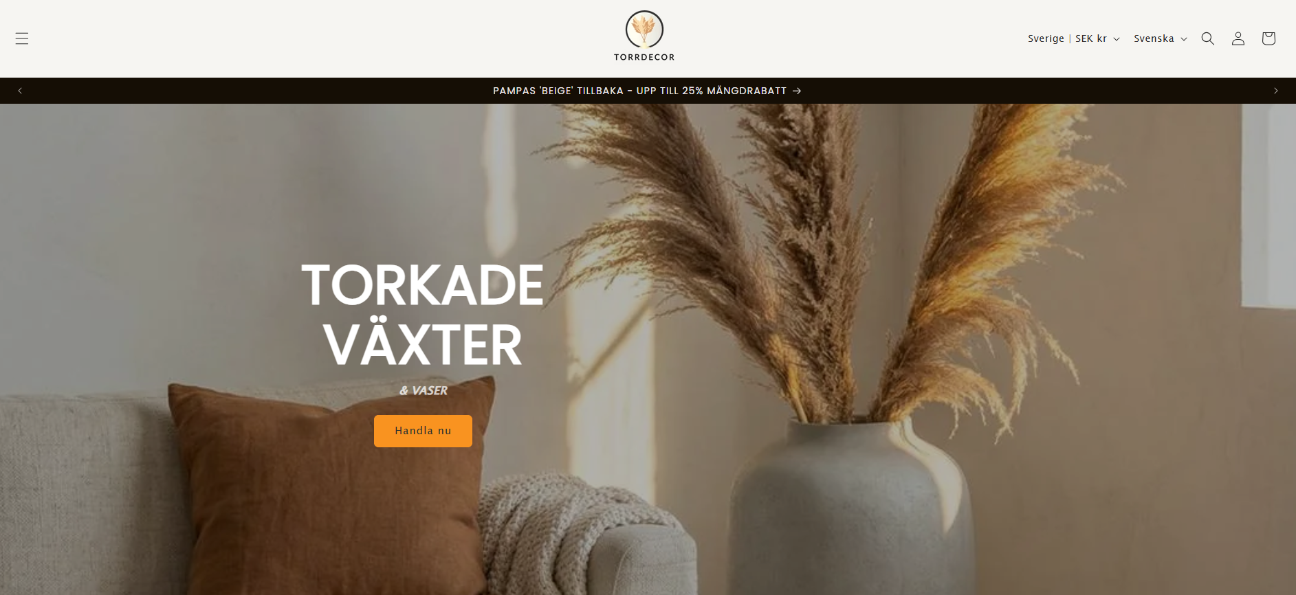
Pampasgräs i beige är en av de mest populära dekorationerna för neutral inredning. Det tillför organisk textur och värme utan att störa färgpaletten. Torrdecors Vas ‘BÅGE’ i cream kompletterar pampasgräset med en stilren form i en ton som fungerar med beige, sand och off-white. Vaserna är tillverkade i Portugal och håller i många år. Torkade växter kräver ingen skötsel och behåller sin form och färg länge. Det gör dem till ett naturligt val för den som vill ha hållbar och vacker inredning utan underhåll.
Vanliga frågor
Vad är neutral inredning?
Neutral inredning är en inredningsstil som bygger på lugna, jordnära färger som beige, greige, sand och varmgrått, kombinerat med naturliga material som trä, ull och linne. Stilen skapar balans och harmoni utan starka kontraster.
Hur använder jag 60-30-10-regeln i hemmet?
Täck 60 % av rummet med basfärgen på väggar och stora möbler, använd sekundärfärgen på 30 % i textilier och mindre möbler, och placera accentfärgen på 10 % i kuddar och dekorativa föremål.
Kan jag blanda varma och kalla neutraler?
Det rekommenderas inte. Att blanda varma och kalla undertoner i samma rum skapar en orolig känsla. Välj en riktning, antingen varm eller kall, och håll dig till den genom hela rummet.
Vilka material passar bäst i neutral inredning?
Trä, ull, linne, sten och keramik är de material som fungerar bäst. De tillför textur och taktilitet som förhindrar att ett neutralt rum känns platt och sterilt.
Hur håller jag ordning i ett neutralt hem?
One-in-one-out-regeln är den mest effektiva metoden. Varje gång något nytt köps in, lämnas något gammalt bort. Begränsa också antalet föremål på öppna ytor till 3–5 objekt och gruppera pynt i tripletter.