

In short:
- Earthy colors are warm, natural tones that create cozy and durable homes. They are best combined in layers with natural materials for variation and depth. Adapting the color choice to the room's cardinal direction and light is crucial for a harmonious result.
Earthy colors are defined as warm, natural tones drawn directly from nature, such as terracotta, ochre, beige, olive green, and cocoa brown. They serve as a stable foundation for interiors that feel safe, cozy, and timeless. According to 2026 color trends, architecture and interior design are moving towards these warm hues to create authenticity and well-being in the home. The connection to sustainability is clear: natural color palettes age beautifully and rarely require redecoration. This guide provides you with practical tools for choosing, combining, and using earthy tones in every room.
1. Which earthy colors will dominate in 2026?
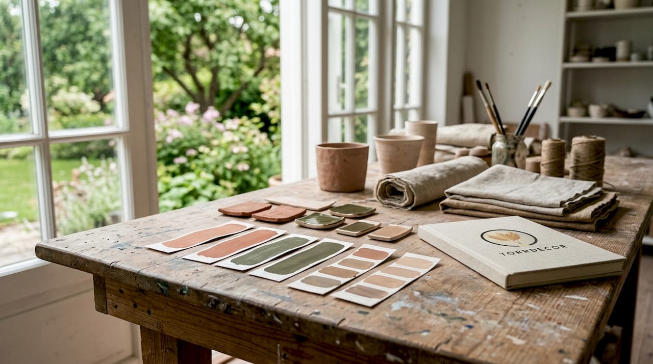
Warm earthy colors like terracotta, ochre, and rusty yellow are leading the trend in 2026. They create an embracing feeling and give rooms a human, genuine atmosphere that cold or sterile tones cannot match.
The most important tones to know:
- Terracotta is a warm reddish-brown shade with hints of orange. It adds warmth and depth, especially in living rooms and bedrooms.
- Ochre is a yellow earth pigment with a long history in painting. It brightens up without being garish.
- Rusty yellow is similar to ochre but leans more towards orange. It works excellent as an accent color on a cushion or a wall.
- Cocoa brown is a deep, warm brown tone that provides stability and luxury without weighing down the room.
- Beige, taupe, and off-white are the neutral base colors. They form the background against which everything else rests.
- Olive green, sage green, and forest green are soft, nature-inspired green hues that bring the feeling of outdoors into an indoor room.
As a complement to the earthy tones, accent colors like fuchsia and aqua highlight the palette without breaking the overall harmony. They are used sparingly, for example, on a flower vase or a cushion.
2. How do you combine earthy colors without it becoming monotonous?
The strength of earthy colors lies not in a single hue but in how they are combined to create an atmosphere. The method is called layering and involves building up the room with multiple shades, textures, and materials within the same color family.
Here's how to work with layering in practice:
- Start with a neutral base on the walls, for example, off-white or light beige.
- Add a middle layer with furniture in wood, wicker, or linen in slightly deeper tones.
- Finish with details in stronger earth tones, such as a terracotta-colored ceramic pot or an olive green textile.
Natural materials such as wood, linen, glass, and ceramics contribute to an organic feel and give the interior long-term durability. The materials create variation in texture, which makes the room feel alive even when the color scheme is narrow.
Pro tip: Never mix more than three distinct shade levels in the same room. Choose a light, a medium, and a dark tone within the same color family for a cohesive result.
Organic forms further enhance the effect. A round vase, a curved sofa, or an irregularly shaped wooden table breaks up straight lines and makes the room feel more natural and relaxed.
3. How does the room's cardinal direction affect your color choice?
The room's orientation determines how much natural light it receives, and this directly affects how a color is perceived on the wall. North-facing rooms benefit from warm tones like beige and terracotta, as they counteract the cold and bluish light that the north side provides.
| Cardinal Direction | Light Character | Recommended Earth Tones |
|---|---|---|
| North | Cold, bluish | Beige, terracotta, warm grey |
| South | Strong, warm | Almost all earth tones work |
| East | Warm in the morning, cold in the evening | Light beige, sage green |
| West | Cold in the morning, warm in the evening | Ochre, taupe, soft olive green |
South-facing rooms can handle a broader palette and even bolder tones like cocoa brown or deep olive green. East and west require more thought as the light shifts throughout the day.
Pro tip: Always test the color in the actual room's light, both in daylight and artificial light, before making a decision. Buy a sample pot and paint an area of at least 50 x 50 centimeters directly on the wall.
4. Color combinations with brown for different rooms and styles
Brown is the most versatile of all earth tones. It works as a base, an accent, and a contrast depending on the shades it is combined with. Variation in shade and texture creates depth with soft transitions between earth tones, making the room feel well-thought-out rather than monotonous.
Successful combinations with brown:
- Brown and beige is the classic combination for a cozy living room. Choose a light beige wall and furniture in walnut or oak for a timeless result.
- Brown and olive green works excellent in kitchens and dining rooms. Green and brown shades draw inspiration from the forest and create a calm, natural atmosphere.
- Brown and ochre create a warm and luxurious bedroom. Combine a dark brown headboard with ochre-colored pillows and a linen bedspread in beige.
- Brown and off-white suits a minimalist style. The contrast is clear but never harsh, and the room feels airy despite the warm tones.
For a more luxurious feel, choose deep brown tones like cocoa brown or espresso and combine them with brass details and velvet in terracotta. For an organic and relaxed style, stick to lighter brown tones and natural materials like rattan and jute.
Accent details in earthy colors, such as dried bouquets, ceramic vases, and wool throws, tie the room together without requiring repainting. The neutral base makes it easy to change the feel of the room with textiles and smaller details.
5. What is the difference between earth pigments and earthy colors?
Earth pigments are a specific concept in painting and pigment manufacturing. It refers to pigments extracted directly from the ground, such as ochre, umber, sienna, and terra di Siena. Earthy colors is a broader interior design concept that includes all tones reminiscent of nature, regardless of whether the pigment is natural or synthetic.
Synthetic earth colors vary greatly between manufacturers, and the same color name can produce completely different results. It is more reliable to choose color based on tone and properties such as opacity and transparency, rather than relying on the name on the can.
For interior design purposes, the distinction is less important. The crucial thing is that the color is perceived as warm, natural, and earthy in the room in question. Always choose with your eye and test in real lighting conditions.
6. How to adapt earthy tones to different interior design styles
Earthy interiors are not a single style. The same color palette works in minimalist, organic, and more classic homes, depending on how you choose materials and forms.
Minimalist style is based on a few high-quality elements. Choose off-white or light beige on the walls, furniture in light wood, and a single accent element in terracotta or olive green. Keep surfaces clean and avoid superfluous details.
Organic style is more generous with materials and textures. Modern organic interior design uses earthy colors together with natural materials and textiles in linen, wool, and jute. Here, it is permissible to mix more shades and add plants, dried flowers, and handmade ceramic objects.
Classic style with earthy colors leans towards deeper tones like cocoa brown, dark green, and ochre. Combine with dark wood furniture, brass details, and patterned fabrics for a warm and timeless room.
Regardless of style, the same basic rule applies: start with a neutral base and build up with layers. Change textiles and decorations when you want to refresh, without having to repaint.
7. Common mistakes when choosing earthy colors and how to avoid them
The most common mistake is choosing color directly from a small color chart. Color samples look different on a small surface than on an entire wall. Color intensity increases when the hue is applied on a large scale, and the result can be significantly darker or stronger than expected.
Three mistakes to avoid:
- Skipping the sample pot. Always paint a large test patch directly on the wall and look at it at different times of the day. Daylight and artificial light give completely different results.
- Choosing too dark at once. Choose a shade lighter than you think when in doubt. You can always go darker, but it is harder to correct a room that feels heavy.
- Forgetting the materials. An earthy wall color without the right materials and textures results in a flat and dull room. Always add at least one natural material, such as wood, linen, or ceramic, to provide depth.
Pro tip: Look at the color sample at three different times: in the morning daylight, in the afternoon, and in the evening with the lamp on. The hue can differ significantly between these times.
Lighting plays as big a role as color. Warm light from incandescent bulbs enhances earth tones and makes them even warmer. Cold LED light can dampen them and give a gray impression. Always choose light sources with a color temperature of 2,700–3,000 Kelvin for earthy tones to come into their own.
Key Insights
Earthy colors create harmonious and durable homes when combined with the right natural materials, adapted to the room's light, and built up in layers with varying shades and textures.
| Point | Details |
|---|---|
| Choose the right base | Off-white, beige, or taupe on the walls provides a neutral foundation that works in any room. |
| Always test with a sample pot | Paint a large patch on the wall and view it in both daylight and artificial light before deciding. |
| Build in layers | Combine three shade levels within the same color family for depth without monotony. |
| Adapt to cardinal direction | North-facing rooms need warm tones like terracotta; south-facing rooms can handle a broader palette. |
| Complement with natural materials | Wood, linen, ceramic, and jute add texture and make earth tones feel lively and authentic. |
Earthy colors are more than a trend
I've worked in interior design long enough to see trends come and go. Earthy colors are not one of them. They reappear again and again, and there's a simple explanation: they reflect how we actually want our homes to feel.
Color has become a tool for well-being in everyday life, and that's not surprising. We spend more time indoors than ever, and the environment we surround ourselves with affects how we feel. Warm earth tones lower stress levels in a way that cold, sterile surfaces never do.
What I see in those who succeed best with earthy interiors is that they don't chase the perfect hue. They start with a neutral base and let the room grow organically with objects they genuinely like. A handmade ceramic piece, a linen bedspread in beige, a dried bouquet in ochre. It is in the details that the whole is created.
What I do see go wrong, however, is when people choose earth tones because they are "safe" and then don't dare to take the next step. The result is a room that feels unfinished and flat. Earthy colors require layers. They require texture. Without it, they don't deliver the feeling they promise.
My recommendation is simple: start with color choice and harmony as a foundation, then choose natural materials that complement, and finish with decorations that say something about you. That's a home that lasts for ten years, not one that looks dated next season.
— a4
Natural decorations that complement earthy tones
Torrdecor offers a range of dried plants and vases that fit perfectly into an earthy interior. Pampas grass in beige is one of the most popular decorations for those who want to enhance the natural feel in a room with neutral colors. It requires no maintenance and retains its shape and color for a long time.

If you want a more dramatic expression, Pampas grass 'VILDA' with its fuller form and natural earthy shade is suitable. Combine with a cream-colored vase made in Portugal for a cohesive and timeless result. The vases are handmade from white clay and harmonize with beige, taupe, and off-white in a way that mass-produced alternatives rarely do.
Frequently Asked Questions
What are considered earthy colors in interior design?
Earthy colors are warm, natural tones like terracotta, ochre, beige, olive green, and cocoa brown. They draw inspiration from nature and create a calm, cozy atmosphere in the home.
How do I combine earthy colors without it becoming boring?
Layer with three shade levels within the same color family and mix natural materials like wood, linen, and ceramic. Variation in texture provides depth even when the color scheme is narrow.
Which earthy colors are suitable for a north-facing room?
Beige, terracotta, and warm gray are recommended for north-facing rooms as they counteract the cold and bluish light. Avoid cold or gray tones that enhance the character of northern light.
How do I test an earthy wall color correctly?
Buy a sample pot and paint a patch of at least 50 x 50 centimeters directly on the wall. Look at it in daylight, afternoon light, and artificial light before making a decision.
Can I change the feel of an earthy room without repainting?
Yes. The neutral base of earthy colors makes it easy to change the room's feel with textiles and decorations. Change pillows, throws, and decorations for a new look without touching the walls.
0 comments