

TL;DR:
- Color choices in interior design affect a room's atmosphere, function, and sustainability, often through color psychology. Natural materials like wood and clay age beautifully and create harmony, enhancing the long-term durability of the decor. Combining four to three interior details and adapting color to the room's function creates a personal and harmonious home.
Color choice in interior design is the tool that dictates how a room feels, functions, and endures over time. In interior design, this is often referred to as color psychology, a concept describing how specific hues affect mood, productivity, and well-being. The role of color choice in interior design extends far beyond aesthetics. The right color in a bedroom lowers blood pressure, while the wrong color in a study can significantly increase stress. This guide shows how to combine color choices with natural materials, decor details, and a room's function to create a home that is both aesthetically and emotionally enduring.
How does color psychology affect a home's mood and function?
Color choices not only dictate the immediate feeling but also impact long-term comfort and productivity. This means that an incorrect color choice in a room you frequent daily can have cumulative effects on your well-being. Color psychology is therefore not a luxury interest for interior enthusiasts but a practical tool for anyone who wants a home that actually works.
A January 2026 study with 443 participants shows clear correlations between color and mental health. Blue and green colors in interiors promote study and well-being, while red and orange colors raise stress levels and decrease concentration. This means that a red kitchen can be energizing for short visits but tiresome in a room where you spend long periods.
Here's how different color categories work in the rooms of a home:
- Blue and green tones are suitable for bedrooms, studies, and reading nooks. They lower heart rate and blood pressure and create a calm that facilitates concentration and recovery.
- Warm neutrals like beige and terracotta work in living rooms and dining rooms. They create warmth without overstimulation, making them easy to live with for a long time.
- Yellow and orange provide energy and are suitable for entryways and kitchens where you want a welcoming and lively impression, but should be used sparingly.
- Darker shades like deep blue, olive green, and anthracite add depth and character to living rooms and libraries, but require sufficient natural light to avoid making the room feel heavy.
- White and light gray are neutral bases that enhance natural light and make it easier to change accent colors without having to repaint the entire room.
The balance between calm and energy is determined by the room's purpose. A bedroom needs recovery, a kitchen needs functionality, and a study needs focus. Choosing color based on function rather than just taste is what distinguishes a well-thought-out home from one that just looks good in pictures.
Pro tip: Always test a paint sample on the wall in at least 30 x 30 centimeters and observe it at different times of the day. Daylight and evening lighting significantly change the hue, and what you love at 10 AM might feel wrong at 8 PM.
What is the role of natural materials in color selection and sustainable decor?
Natural materials and color choices are linked in a way that synthetic alternatives never quite manage to replicate. Natural materials age with patina and become more durable and aesthetically pleasing over time, which fundamentally distinguishes them from synthetic materials that lose shape and look tired. This means that a home decorated with natural materials actually improves with age, rather than needing to be replaced.
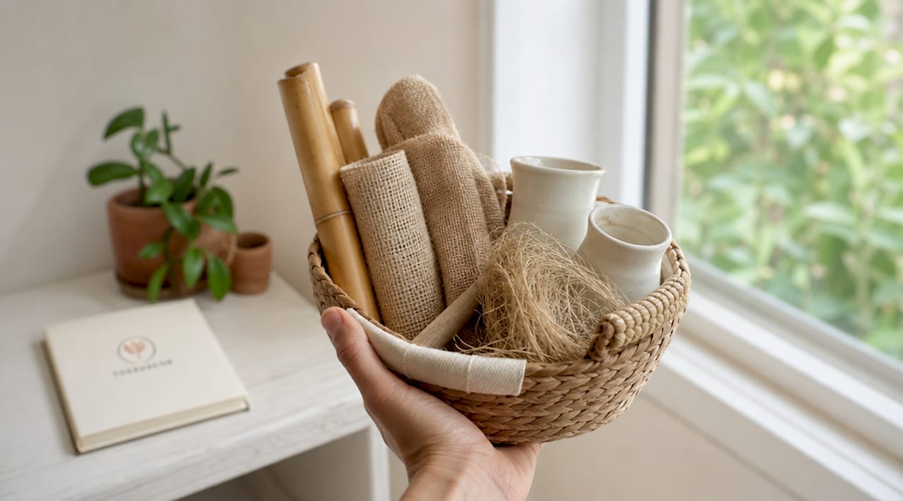
The role of natural materials in interior design is about letting texture and natural color palettes do the work. Wood, linen, wool, clay, and dried plants all carry an inherent color palette of beige, gray, green, and earth tones. These tones interact naturally with each other and require minimal coordination. A white clay vase next to a bundle of dried pampas flowers and an oak shelf creates harmony without you needing to think about a color wheel.
Earthy colors and natural materials create balance and calm as a counterpoint to everyday stress. Beige, gray, green, and muted colors are particularly effective for harmony in the home. This is also why the Scandinavian interior design tradition, with its emphasis on natural materials and neutral palettes, continues to be globally relevant.
A practical advantage often overlooked is that natural fibers repel dirt and are easy to keep clean, making them suitable even in family homes. It's an argument for sustainability that goes beyond aesthetics and into everyday life.
Pro tip: Mix at least three different textures of natural materials in the same room, for example, a wool throw, a wicker basket, and dried plants in a clay vase. Texture variation creates visual depth without you having to introduce more colors, keeping the palette cohesive and calm.
The combination of the role of natural materials in the home with a conscious color choice yields a result that lasts longer than trends. Natural materials do not require you to replace them every season. Instead, you can change textiles and details in accent colors while the base of wood, clay, and natural fibers remains timeless. Learn more about how to put this together in Torrdecor's guide on natural decor.
How can decor details and color choice collaborate for a personal home?
Interior details are the elements that complete a room, but they are also the most common sources of visual chaos. The role of interior details in a color-coordinated home is that each detail either reinforces the color palette or breaks it in a conscious way. Randomly purchased details without regard to color and form create a room that feels messy despite being tidy.
An analysis of common decor details that cause clutter points out four categories: too many throw pillows, text signs with phrases, scented candles of different sizes without order, and mixed frames without a cohesive color palette. The common thread is that these details are often bought individually without fitting into the whole. The result is a room that communicates disorder rather than personality.
Here's how to create a functional balance with details and color:
- Choose a neutral base. Walls, floors, and large furniture should stick to a cohesive neutral palette, such as white, beige, and gray. This allows the details to stand out.
- Introduce accent color in odd numbers. Three pillows of the same color, a vase, and a piece of art in the same tone create rhythm. Two of the same create symmetry that can feel stiff.
- Limit the number of active colors to three. A base, a secondary tone, and an accent color are enough for most rooms. More than that requires professional coordination to avoid clutter.
- Let details in natural materials be color-neutral. Dried bouquets, clay vases, and wooden bowls add texture without competing with accent colors.
Personal decor is best created through a mix of new and recycled items. A second-hand chair in an accent color next to new neutral furniture adds character and sustainability at the same time. It's a way to create a personal home without buying everything new and without losing color harmony.
Pro tip: Photograph the room in black and white to check the contrast. If the image looks balanced with clear light and dark areas, the color distribution is probably good. If everything blends into a gray mass, the room lacks contrast and needs either a darker accent color or more light surfaces.
Interior accessories are a subject in themselves, and there are clear guidelines on how to choose them without creating visual noise.
What strategies exist for combining color choice with room function?
Color choice adapted to room type and use is the most concrete way to use color psychology in practice. The strategy is based on matching the psychological effect of the hue with what you actually do in the room. It's no more complicated than that, but it requires you to consider the purpose of each room before choosing a color.
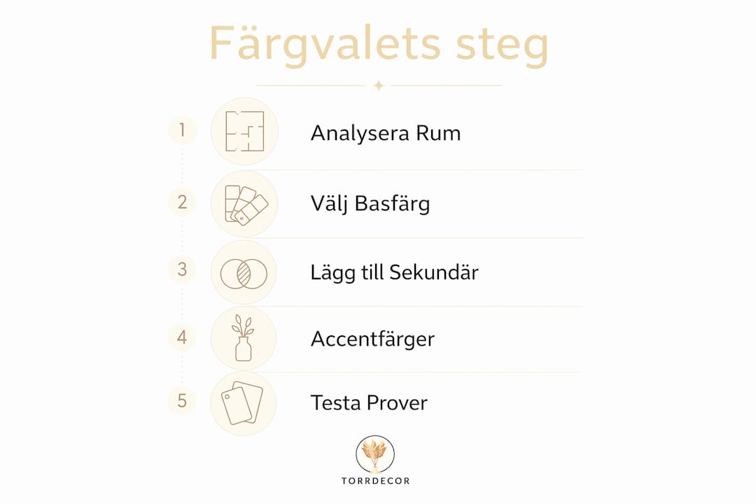
Here is a practical five-step framework:
- Define the room's primary function. Sleep, work, cooking, socializing, or relaxation require different color strategies.
- Choose a base color based on function. Cool tones for focus and rest, warm tones for energy and socializing.
- Test the color in the room's actual lighting conditions. North-facing rooms need warmer tones to avoid feeling cold, south-facing rooms can handle darker hues without becoming heavy.
- Add a secondary tone from the same color family. Blue and greenish-blue, beige and terracotta, gray and dark gray. An analogous color scheme provides harmony without effort.
- Choose an accent color from the opposite side of the color wheel for contrast. Blue base with mustard yellow accent, green base with rust tones. Contrast adds life without disturbing the whole.
The comparison between light and dark colors is central to understanding how color affects a room's perceived size and atmosphere:
| Property | Light colors | Dark colors |
|---|---|---|
| Perceived room volume | Makes the room larger and airier | Makes the room more intimate and enveloping |
| Light reflection | Enhances natural and artificial light | Absorbs light, requires more lighting |
| Psychological effect | Calm, openness, purity | Warmth, depth, character |
| Maintenance | Highlights dirt and scratches more clearly | Hides dirt but shows dust and fingerprints |
| Best suited for | Small rooms, bedrooms, studies | Large rooms, living rooms, dining rooms |
Standard furniture can be converted with color and moldings to feel custom-built, a cost-effective way to elevate decor quality. This means you don't have to replace furniture to refresh a room. A new color on an existing bookshelf, combined with the right moldings and lighting, can create a completely new impression without major investment.
Color coordination in retail environments and salons follows the same basic principles but with a clearer focus on customer experience. The role of interior details in retail and the role of interior details in salons is about how color and materials communicate the brand's identity even before the customer sees a single product. Earthy tones and natural materials signal sustainability and quality, while strong contrasts and bright colors signal energy and modernity.
Key takeaways
Color choice in interior design is a practical tool that governs mood, function, and sustainability in every room, and it yields the best results when combined with natural materials and well-thought-out decor details.
| Point | Details |
|---|---|
| Color psychology guides function | Choose cool tones for focus and rest, warm tones for energy and socializing. |
| Natural materials enhance the palette | Wood, clay, and natural fibers carry natural earth tones that harmonize without coordination. |
| Limit active colors | Stick to three colors per room: a neutral base, a secondary tone, and an accent color. |
| Details require selection | Choose decor details that reinforce the palette, not compete with it. |
| Light versus dark colors | Adjust the brightness of the hue according to the room's size and lighting conditions. |
Color Choice and Natural Materials: What I've Actually Learned
The advice I see most often repeated in decor contexts is to "dare to use color." It's well-intentioned but often misleading. The problem isn't that people are too cautious with color. The problem is that they choose color without considering function, and then wonder why the room doesn't feel right even though it looks good in pictures.
What I've seen work time and again is to start with the materials, not the color. When you choose an oak floor, a linen sofa, and a white clay vase, you already have a color palette. That palette tells you which accent colors will fit. You don't need a color wheel. You just need to listen to what the materials are already saying.
Another thing rarely mentioned is that sustainable decor and well-thought-out color choices are economically intertwined. When you choose a timeless neutral base and natural materials that age beautifully, you don't need to replace all your decor every time a trend shifts. You replace a pillow, a piece of art, a bouquet of dried flowers. That's sustainability in practice, not just in theory.
What I actually recommend is to choose a color palette you can live with for ten years, not one you love today. It's a tougher question than it seems, but the answer to that question almost always leads to earthy tones, natural materials, and an accent color you're truly serious about.
— Torrdecor
Create Your Home with Torrdecor
Torrdecor offers dried plants, pampas grass, and decorative clay vases that fit directly into an earthy and sustainable color palette. The products require minimal maintenance and last a long time, making them a natural choice for those who want decor that doesn't age poorly.

The assortment is designed to work with neutral bases in beige, gray, and white, and each product is selected with texture and natural color scheme in mind. Whether you are furnishing a home, a store, or a salon, you will find products that enhance your color palette without overpowering it. Visit Torrdecor about us to learn more about the assortment and get inspiration for your next decor project.
FAQ
What is meant by color psychology in interior design?
Color psychology in interior design is the study of how specific hues affect mood, concentration, and well-being in a room. Blue and green tones calm and improve focus, while red and orange tones boost energy and stress levels.
Which colors are best suited for the bedroom?
Blue, green, and muted neutrals like beige and light gray are best suited for the bedroom. These colors lower heart rate and blood pressure and create the conditions for rest that a bedroom needs.
How do I combine natural materials with color choices?
Choose natural materials like wood, linen, and clay as a base. These carry natural earth tones that harmonize without coordination, and you can then add an accent color in textiles or artwork without losing harmony.
How many colors should a room have?
A room works best with three active colors: a neutral base, a secondary tone, and an accent color. More than three colors require professional coordination to avoid creating visual noise.
Do dark colors make a small room even smaller?
Dark colors make the room more enveloping and intimate, but they don't necessarily make it smaller if the lighting is sufficient. In a small room with good light, a dark accent wall can add character without making the room feel cramped.
0 comments